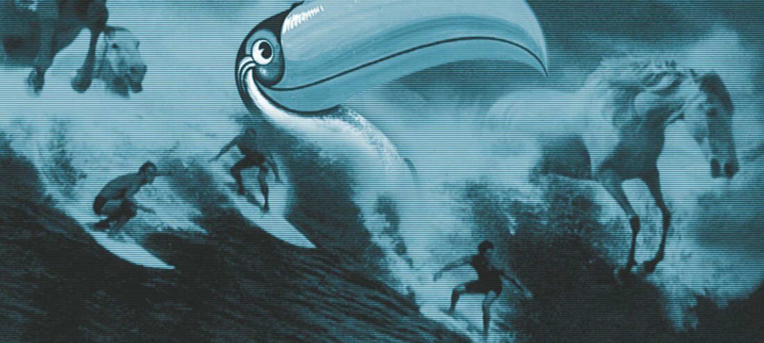
The story behind Guinness’s legendary ad campaigns
Enter the creative world of the genius behind the adverts that made the Guinness brand
The two men would have beaten a similar path through the Liberties to one I myself am now treading. Tasked with intelligence gathering, copywriters Oswald Greene and Bobby Bevan visited the Guinness brewery in 1927 to learn all they could about stout in the hope it would spark their creativity for the inaugural Guinness advertising campaign. It was a seminal moment.
Nearly 90 years on, a bitterly cold wind, enriched with the coffee aroma of roasting barley, roars through the same cobbled lanes they strode down as I follow on their heels into the bowels of the old St James’s Gate brewery.
I’m on my way to meet archivist Eibhlin Colgan at the Guinness Storehouse, the nerve centre of the brand as we know it today and home to its archives. For the contemporaries of Greene and Bevan, she is often the first port of call for new campaigns. In much the same way, I’m hoping my visit will be a point of departure in understanding the advertising juggernaut that Guinness has become.
Guinness had been successfully operating for 170 years before the first national advertisement was printed in Britain in 1929. What need was there to advertise?
“Lord Iveagh was reluctant back in the 1920s to advertise. He very much felt that if you had to self-promote your product, it meant that your product was sub-par,” explains Colgan, pointing to an austere, wall-mounted newspaper clipping.
“When he was eventually convinced that this was the way the world was going, he laid down the diktat that he would only allow the company to advertise if the quality of the advertisement was the same as the quality of the beer.”
The column advert is matter-of-fact in tone, limited in illustration. It simply details and emphasises the company’s achievements, as well as its notable health benefits: “Guinness builds strong muscles … It enriches the blood; Doctors affirm that Guinness is a valuable restorative after influenza …”
While it was the first use of the well-known slogan “Guinness is good for you”, it marked an auspicious start for a company now associated with being on the cusp of edgy, often flamboyant advertising. Perhaps Colgan had a point, though. As a company, Guinness had been successfully operating for 170 years before the first national advertisement was printed in Britain in 1929. What need was there to advertise? Of course nowadays, that’s a rhetorical question.
Like a red-brick fortress, the former plant in which we’re standing guards the company’s unique history and folklore. There’s an immediate sense you’re never too far away from the ghosts of generations of brewers past. Even in the warren of laneways running between vat houses, the skeletal remains of the brewery’s disused narrow-gauge railway protruding up through the wet cobbles are a reminder of past glories.
Back then, these rails would have been used to transport 8,000 casks a day, as well as to haul malt wagons, spent grain and hops around the 64-acre site, by then the largest brewery in the world.
As synonymous as it may be with Irish culture globally, Guinness itself represents part of the soul and mystique of a bygone Dublin. And while barges charged with casks no longer puff up and down the River Liffey, the brewery is as much an integral part of the glass-fronted cityscape of modern Dublin as it has ever been.
Without digging too deeply, it’s obvious that advertising has acted as the linchpin to secure this legacy for future generations of Dubliners. What isn’t so glaring, however, is how Guinness became such an advertising force to be reckoned with seemingly overnight.
Spread out on the bench in the archives room are what can only be described as the inner workings of a creative genius.
During 35 years of his career, John Gilroy produced well over 100 classic Guinness press and poster adverts, first as an in-house artist at S. H. Benson’s advertising agency and later as a freelancer.
A chance visit to a circus changed the course of advertising forever when Gilroy spotted a sea lion balancing a ball on its nose. It was the first and arguably the finest of a series of “My Goodness, My Guinness” adverts that went on to feature a series of zoo animals, characters instantly associated with the brand. Perhaps the most emblematic was the exotic toucan, which appeared extensively on billboards, memorabilia and later gable end murals on pubs across Ireland.
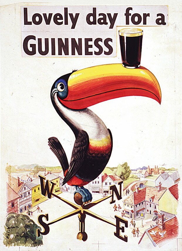
“When all these animals were produced, it was the 1930s and they were mainly shown in smog-filled London – just after the 1929 crash, a little bit of a grim place probably to be living,” says Colgan. “Then there’s these really different, colourful icons beaming down from billboards. I think the toucan really caught the public’s imagination the most. They took it to their hearts.”
Gilroy also produced some of the most enduring advertising images of the period with the “Guinness for Strength” campaign (a message that would fall foul of today’s advertising codes), which included the likes of a 1934 ad of a workman carrying a girder and a 1949 ad of a farmer pulling a horse and cart – Gilroy’s personal favourite. The drawings Colgan has dug out from the archives in front of us all happen to be concepts for this particular campaign.
“He would have started off with the initial pencil sketches, and you can see it was literally torn out of a blotter or sketchbook. He would have developed from this into colour crayons or colour charcoal,” says Colgan, “and then into full-on water colours.
“You can really see his creative process, how he would have gone about taking an initial idea and really developing it up and then working thoroughly to the final product; you can even see here he’s tippexed parts out on this one.”
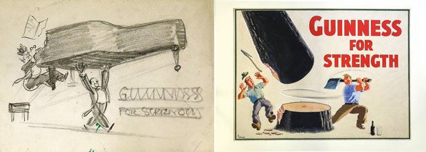
The attention to detail and his technical skill with a range of implements is impressive. In one instance, you can see how he agonises over the positioning of the arms of a concert pianist carrying off a grand piano, sketching first in pencil then brusquely doodling in ink below it. In the subsequent version, his modifications are made and presented in colour, with the slogan “Guinness for Strength” roughly positioned in crayon.
“There’s always that little bit of humour. Just that small detail that you maybe wouldn’t notice at first glance.”
For his part, Gilroy later said in an interview, “I have always been a jolly man and I thought the Guinness campaign needed a touch of humour.” This was certainly evident in the unflattering caricature of himself he employed as the distraught zookeeper outwitted by his menagerie of mischievous animals.
Such timeless humour also stands out in a sketch for an abandoned “My Goodness, My Guinness” poster depicting a man consuming his doctor’s pint of Guinness intravenously, harking back to the interwar period when post-operative patients and blood donors were given Guinness for its purported high levels of iron.
The Guinness advert was one of the first shown in the first ad break on the first night of commercial television in Britain
Gilroy produced his last Guinness artwork in 1961. By then, the winds of change had shifted and the power of a new medium was becoming ever more prevalent. Television had reached the UK by the mid-1950s, with ITV, the first commercial channel, launched in September 1955. Once static figures looking down from billboards, the familiar guise of the hapless zookeeper and a canny, Guinness-poaching sea lion – Gilroy’s first characters – were suddenly real and moving, prefaced with the grainy flicker of text on the black and white screen: “A Guinness poster comes to life.”
The Guinness advert was one of the first shown in the first ad break on the first night of commercial television in Britain. A baton had been passed from one medium to another.
He waits. That’s what he does. And I’ll tell you what: tick followed tock followed tick followed tock followed tick.’
With perhaps one of the most memorable monologues in the history of television, ‘Surfer’ has been consistently voted one of, if not the best, TV adverts of all time.
For Yvonne Chalkley, the AMV BBDO agency producer who worked on the project, it was a career-defining moment. While the contemporary discipline of advertising has changed beyond recognition since Gilroy’s golden age of print advertising, Chalkley in many ways echoes the man who spent much of his career working on Guinness advertising. Of her five campaign adverts for the Guinness account, ‘Surfer’ has by far become the most memorable.
‟Even at the edit stage the clients were insisting we keep it in colour”
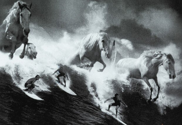
“Tom Carty and Walter Campbell – the AMV creative team who wrote the ‘Surfer’ script – were inspired by a picture they found depicting horses as waves in the sea,” she says. “They had already written the script and story but then got the thought of making the waves into horses.”
The painting in question is Neptune’s Horses, an oil painting from 1892 by a prolific artist and illustrator of the Victorian period, Walter Crane. The association between white horses, galloping atop the crest of tsunami-like waves driven along by Neptune, the Roman god of the sea, and ‘Surfer’ is clear. But as striking as the concept is, this alone surely would not have made the advert as iconic as it was to become?
“I think getting the director, Jonathan Glazer, on board really moved the idea on. He also had a vision and together they [Carty and Campbell] totally pushed the idea,” says Chalkley. “Even to having it in black and white.”
Guinness initially resisted the Sexy Beast director’s monochrome stylings, Chalkley explains, preferring it to be in aired in colour. “Even at the edit stage the clients were insisting we keep it in colour. But once we got into adding the horses they came on board with our vision of black and white. I think it would have had a huge effect on the film if it had been in colour.”
While filming in Hawaii, the crew were fortunate enough to make use of the largest swell in 10 years. Despite shooting with a group of skilled local surfers, they struggled to find their ideal protagonist, the face of the advert. “We finally found him sitting on a beach – he wasn’t a great surfer but had the right look. As he couldn’t surf the huge waves, we had to film another surfer and put our lead guy’s head onto him.”
A further four-day shoot was needed back in the UK to film white horses against a green screen to juxtapose with the surging crest of the wave. With so many variables working against them during a long shoot – not least a reliance on temperamental animals and Mother Nature – there was a lot riding on the execution of the final piece. Of course, the creative process didn’t cease when the cameras stopped rolling.
“Finding such a great track – really underground at that time – with the beat it had, made the film come alive,” says Chalkley.
With so many elements needing to harmonise, the project could have failed had the script and voiceover been flat and prosaic against the distinctive beats of Leftfield’s ‘Phat Planet’. Chalkley agrees. “The inspiration of the poetic words made a big difference. This happened quite late in the day really. It was inspired by Under Milk Wood and Richard Burton’s voice. I think this added another layer and level to the piece.”
Written by the celebrated ‘drunken and doomed’ Welsh poet Dylan Thomas, Under Milk Wood, the ‘Play of Voices’, was first broadcast on BBC radio with an all-Welsh cast just weeks after his premature death in 1954.
The narrator on the broadcast was Hollywood wastrel Burton, a role he would reprise several times over the decades in subsequent radio and TV productions. Rewatching ‘Surfer’, you can imagine the euphonious baritone of the Shakespearean actor deftly replacing the voice-over in the advert. “‘Here’s to you, Ahab!’ And the fat drummer hit the beat with all his heart.”
This feature appeared in issue 10 of Hot Rum Cow. To read more, pick up a copy from our shop or look for a local stockist.